OPR News
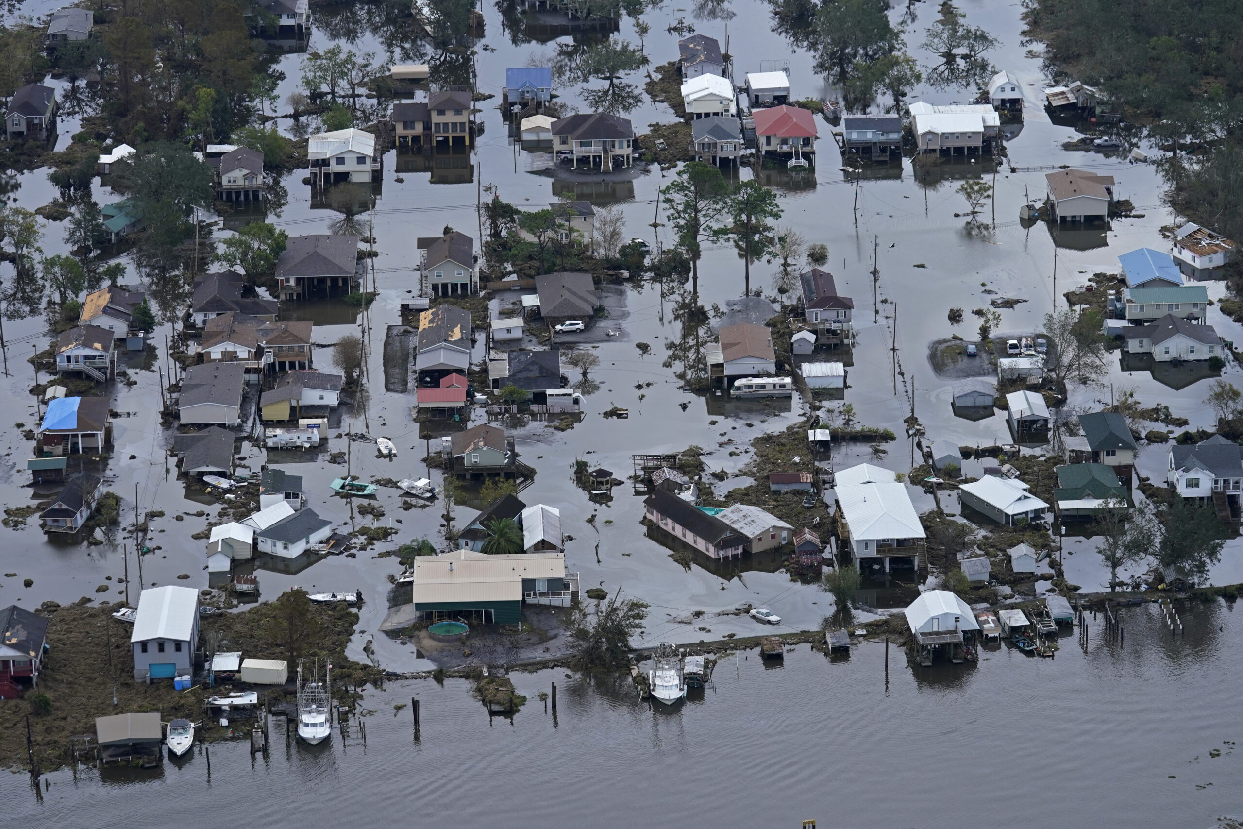
Operation Photo Rescue Coming to LaPlace, LA
Operation Photo Rescue (OPR) has been inactive since the Pandemic and at one point there were discussions on whether to fold. It wasn’t like there wasn’t plenty of disasters where help was needed. Covid and its variant posed problems we couldn’t workaround. And then OPR received an email from Gerald Herbert, Associated Press Photographer, asking if we would be willing to partner... [Read more]
Beaumont, TX Copy Run November 22-23, 2019
Operation Photo Rescue will be coming to the Theodore John Library on November 22-23. Please see the contact information below. Photos Courtesy of the The Enterprise Beaumont, TX. Photographers: Ryan Welch and Kim Brent (thumbnail). Flyer: Victoria Walters Read More →
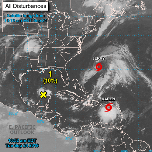
Hurricane & Tropical Storms
Tropical Storm Karen threatens flooding in Puerto Rico. This comes after Hurricane Maria in September of 2017. While they dodged the bullet with Hurricane Dorian, the Grand Bahama Island was flooded with 20 feet of water over 40 hours. Flooding also happened along the eastern coast of the US and recently Hurricane Imelda dumped 40 inches of rain in parts of Texas. While Operation Photo Rescue... [Read more]
2018 Coming to a Close
As the holidays approach and we are seeing 2018 in our rear-view mirror; it becomes a time for reflection and appreciation for all that has been accomplished. We started with a backlog of over 2,000 photos from the Baton Rouge and the Houston copy run. We are now close to completing by the beginning of 2019. As we look ahead to 2019 and our next copy runs, we hope to be able to partner with... [Read more]
Preservation Houston Hosts OPR Copy Run
Beverly DeJarnett sorts through her damaged photos as volunteer Kathy Washburn looks on. Matthew Nothelfer, videographer for Path 88 Productions, covering the copy run as part of a documentary on scrapbooking and the connection photos hold. Photo: Margie Hayes Back in September I received an email from David Bush, Executive Director of Preservation Houston, wanting to know if we coordinate with local... [Read more]

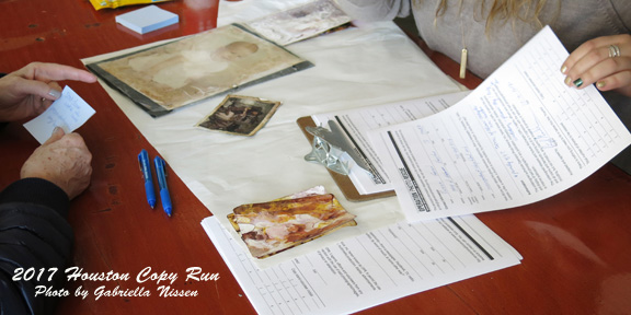
Houston Copy Run: December 9-10
It seems like yesterday, but our last copy run was held in April of this year at the East Baton Rouge Parish Library in Baton Rouge, LA. Thanks to Melissa Easton, Archivist/Librarian, the run was a huge success. We had such a large turnout bring in over 2,000 photos. With only four regular OPR volunteers we were shorthanded. If it hadn’t been for Melissa and her staff helping, we could not have... [Read more]
Read More Posts From This Category